Friday, 8 April 2016
Thursday, 7 April 2016
Wednesday, 6 April 2016
Looking back at your preliminary task, what do you feel you have learnt in the progression from it to the full product?
Looking back at your preliminary task, what do you feel you have learnt in the progression from it to the full product?
Preliminary Task College Magazine Music Magazine Front Cover


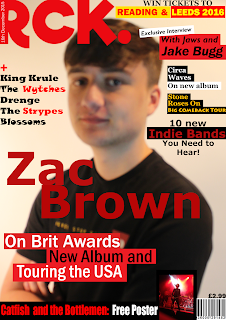
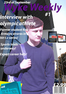
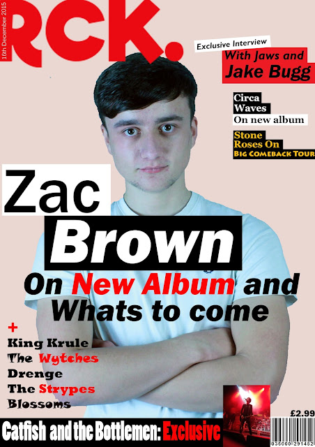
In order to complete my preliminary task I had to design a college magazine front cover, the basis of this preliminary task was basically preparing me and giving my the beginners skills for my main task which was to design a final product on producing a front cover, contents page and double page spread for a music magazine of my chosen genre, which was indie-alternate music. Also, the preliminary task helped advance my knowledge, skills and ultimately helped me gain experience in using Photoshop. The image below shows the all the specific features I have learned from creating my preliminary task and the skills that I have began to develop whilst design my final magazine products.
In the image below shows a short breakdown of my preliminary college magazine front cover in comparison to my final products. The main advantages of creating the preliminary task allowed to me grasp a good knowledge of the key codes and conventions that are vital when needing to be applied to a magazine front cover to make it appealing and attractive to my specific targeted audience which in my case, is the indie-alternate scene. My preliminary task showed me how important applying the key codes and conventions because my preliminary task was rather unconventional the faults of the magazine are very clear to see. For instance, it isn't clear which story is the main story as all the fonts and sizes are practically the same. Additionally, my model on my magazine has no relevance to the magazine as he's not named on the front cover, nor is there a feature story related to him. Also, there appears to be no exact three-way colour scheme which is essential into forming a traditional magazine, as people associate colours with a brand, for example, the 'NME' is mainly associated with red, black and white.

What have you learnt about technologies from the process of constructing this product?
What have you learnt about technologies from the process of constructing this product?
During the process of developing my product, in order to be creative so that my work can be presented in a wide variety of different formats, I needed to adapt to many different technologies. I have used a variety of different technological platforms, for example Photoshop, which I used to create my Front Cover, Double-Page Spread and Contents page. At first I found Photoshop very confusing and was often stuck on what to do on the platform, however once I had much more practice and then I started to get a lot better at is as a result. Additionally, the various amounts of different technologies are very visible within my blog. For instance, in my summary of conventions post, I recorded me describing the different conventions on a video which I believe makes it much more creative and different.
Photoshop
During the course of developing my product, I used the media platform 'Adobe Photoshop CS6' several times when developing and creating my front cover, contents and double page spread. I used a variety of different editing skills in order to make my product to the best of it's potential and to make it look extremely conventional. Some of the basic tools include; Paint Bucket; Eraser; Crop Tool; Polygonal Lasso Tool and many more. In the series of shots at the bottom of the page I'm going to show how I used each tool to make one of my Google mock up products.
Over the course of using Photoshop I believe I have improved at editing with that specific software, though, at first I did struggle using the software and it would often take me a significant amount of time for a very simple task, for example removing the background from a picture which needed to be removed. Ultimately, I think Photoshop has made my product a lot better because the editing looks very smooth and I think if you compare my preliminary task and my final product you will see a massive difference in skill.
Blogger
Throughout the course I have used this tool which allowed me to publish my work. I have organised all of my work on blogger and it is a massive advantage because it allows me to add a variety of different types of media formats like YouTube, Prezi etc. Which has added creativity to my work.
It allowed me to be very organised and it's now extremely easy to find certain pieces of my work which is useful if I need to look back and see if I need to change any pieces because I'll always know where about's it is placed.
Prezi
Prezi is a cloud-based presentation software which allows you to present your work in a fun, easy and creative manner. I have used Prezi throughout my work to present work and ideas. It allows you to choose different templates which differs from the usual power point presentation and adds a variety from it as it allows different coloured templates etc. It can also be uploaded to blogger very easily which is also an advantage. It's extremely easy to embed one of my Prezi Presentations onto Blogger because all I need to do is go to html, then copy the link of the presentation, copy and paste the link onto my blog and then press compose. Which is useful because it allows me to put my creative ideas from a better presentation website onto Blogger which allows me to keep organised.Power point
Power point, like prezi is a presentation software which allows you to creative presentations, I have only used this software on a small number of occasions because I find that 'Prezi' has a more creative aspect and is easier to apply onto blogger. However, it is very easy to use and at the beginning of the project when I was new to 'Prezi' I found it much easier in comparison to 'Prezi'.
Scribid
I used scribid when uploading powerpoint presentation onto my blog, which makes it much more efficient then just uploading slide by slide onto my blog, it's also easier for those reading my blog as you are able to zoom in and out to see the text if you are unable to see it.
YouTube
When beginning my work I'd never created or published a YouTube video before and it's extremely simple and easy for getting a video online which made it very easy for me with time restrictions.
Camera
I used a Nikon D3300 Camera which included a 55-200mm Lens to take all photos, except the gig pictures which were taken on my Iphone.
Tuesday, 5 April 2016
How did you attract/address your audience?
How did you attract/address your audience?
I asked three people four questions regarding my magazine in order to obtain a grasp of what my audience felt about my final products.
Questions for feedback asked in the feedback video.
Questions for feedback asked in the feedback video.
- From what subjects on my magazine tell you what genre my magazine follows?
- Do you think my magazine has met the expectations of typical indie magazine? If so, how?
- Would you consider buying/subscribing to this magazine?
- In comparison with other existing products, does the style of my magazine follow key codes and conventions?
Friday, 1 April 2016
Wednesday, 23 March 2016
Feedback
Feedback
After completing the draft versions of my front cover,
contents page and double page spread I went and asked a few media students and
individuals that I knew would represent my target audience, because they were
14-26, and they liked indie-alternate music, as well as other factors that I
have discussed.
Front Cover
The majority of the feedback I received was fairly positive,
mainly saying they thought the masthead was good because it was conventional
and represented the indie-alternate genre extremely well and was easily distinguishable
from other genres because of the conventions. Additionally, they said the sell
lines and plug used were good because they related and appealed to my target audience. On the other hand, there was also negative
feedback.
- "The colour choice on the main feature story needs to
be a stronger, more vibrant red”
- "The sell lines could be presented in a more creative
way
Most of the feedback I received was positive, for example.
the sell lines are appealing and relevant to the genre, but here are some
examples of the feedback I received:
- "Your front cover represents the codes and
conventions of an Indie-alternate magazine very well. The colour scheme you
have chosen helps develop the genre."
- "The model represents the indie genre."
Contents Page
On this product, it was again mainly positive feedback with
some faults. From my feedback I found that people liked the band index because
it follows the colour scheme, therefore creating continuity, and because its
conventional to a magazine. And there were positive reviews regarding the
layout of the contents page. Again, there was also some negative comments:
- "The subscription
box is messy”
- "The
background on the picture od ‘Dan Smith’ is not good".
- "Have to add a
page number regarding ‘Callum Brady-Temple."
A person who gave me feedback on this product said "too
much text on the contents page which makes it look squished." However,
they did also say that "the gig pictures used are unique, creative and
appealing to the audience."
For my double page spread, I received more negative constructive
criticism then the other two products I made. Mainly regarding how most of the
page isn’t covered up and it feels a little blank. However, there was some positive
feedback, mainly saying that the headline, stand first and pull quote were
good.
The feedback on this
product was:
- "There is no need for your logo on both pages”
- "There are too many drop caps."
- "The general layout of your double page spread is good,
it just needs more to make it look complete."
Front Cover Development Process
When starting my Front Cover, I wanted to plan the whole process in order to create the most conventional and successful Front Cover. Firstly; I created many digital drafts in order to give myself a basic and simple plan of what lay out I wanted to achieve, those of which I will hopefully use in my final design of the Front Cover.
Contents Page Development Process
When starting my contents page, I wanted to plan the whole process in order to create the most conventional and successful contents page. Firstly; I created many digital drafts in order to give myself a basic and simple plan of what lay out I wanted to achieve, those of which I will hopefully use in my final design of the contents page.
Double Page Spread Development Process
Double Page Spread Development Process
When starting my double page spread, I wanted to plan the whole process in order to create the most conventional and successful double page spread. Firstly; I created many digital drafts in order to give myself a primary and simple plan of what lay out I wanted to achieve, those of which I will hopefully use in my final design of the double page spread.
I personally like the layout to this specific design because I believe it's spacious and looks aesthetically appealing and also includes all the conventions such as a pull quote and a stand first which are expected from a double page spread of a magazine.
In this digital draft I have given a brief statement about what each convention will do for my double page spread.
Google Mock Up
This is my google mock up double page spread draft, however i want to change various things in order to improve my mock up in several ways, such as make it more conventional, i looked at other magazines similar to mine to see if i could add anything to improve this.
Firstly, in many other magazines the pull quote was vibrant and attractive, although i think i have a vibrant colour, the font and other things such as emphasis on certain words which was more important was missing, therefore changed the font and placed emphasis on the words 'New Album' as i thought that is what the fans care about the most and therefore made it the most important factor in the pull quote.
Next, i thought i needed to implement my own brand upon the magazine, i did this by adding my logo into the bottom left corner alongside the page number, which i thought was conventional and essential into implementing my brand into the magazine. Also i noticed that the image of the Kasabian album was almost floating and didn't necessarily fit into the magazine so i simply replaced it to make it more in place and i think it makes the magazine look more formal as a result.
Finally, the article looks extremely messy so i straightened the writing and as a result it became more conventional and formal looking and not all over the place.
Tuesday, 22 March 2016
Subscribe to:
Comments (Atom)


