
Thursday, 24 September 2015




Wednesday, 23 September 2015
Name Ideas etc
Name ideas
- College
- Life at College
- College Weekly
- Student
- The voice
- Campus
- Life on Campus
- Times
- Wyke
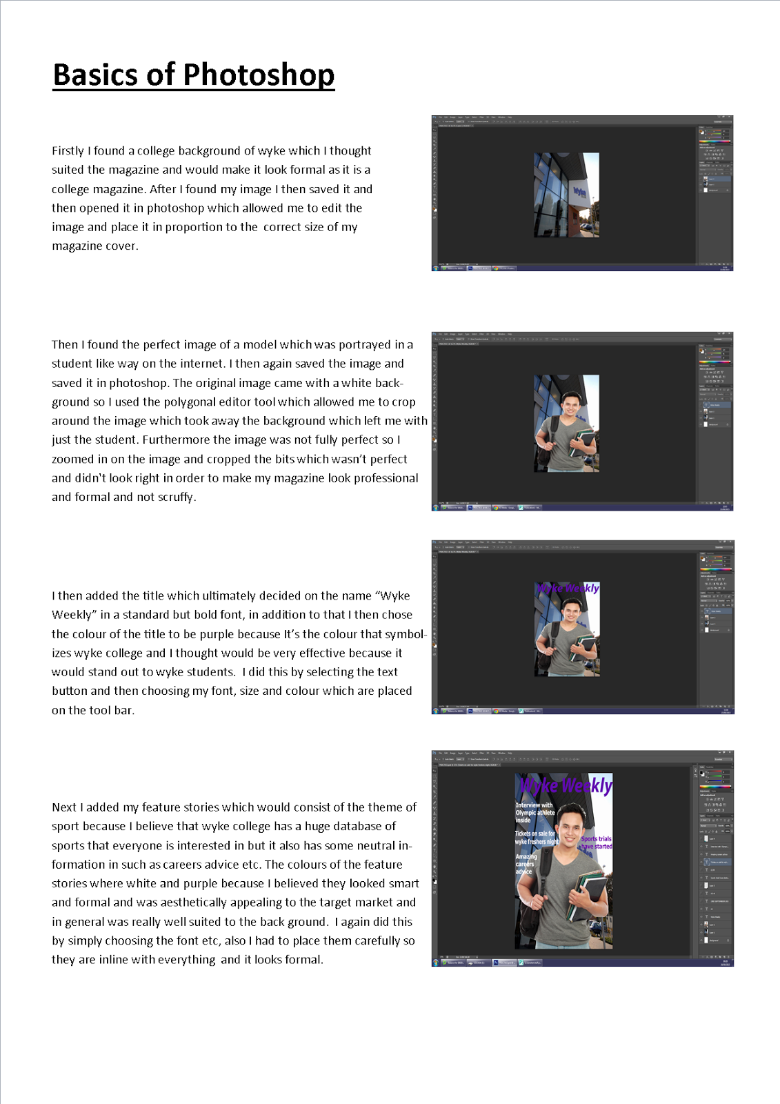
- Wyke Weekly
- Outlook
Colour Schemes
Purple, white and lilac
Purple, Black and White
Purple, Yellow and White
Blue, Orange and black
Red, Orange and Yellow
Green, Light Blue and White
Blue, black and white
Purple, Yellow and White
Blue, Orange and black
Red, Orange and Yellow
Green, Light Blue and White
Blue, black and white
 I have chosen to use purple black and white because the main colour which symbolizes wyke is purple so i will be using that certain colour and I'll be using the black and white in my texts etc. I also might use other colours to make it look more aesthetically appealing for example gold which is also featured in the wyke logo and I feel like it is also a very formal and posh colour which is portrayed as fancy and formal which i want my magazine to be. I also considered using green, light blue and white because they are vibrant and also it would make it look appealing and may catch the eye of the audience, however I want my magazine to be formal and I think if I used these primary colour it may present my magazine to be childish and informal which is the wrong approach because my target audience are young adults so they will not be appealed to
something which is childish and inappropriate.
Feature story ideas
- Tickets on sale for the freshers party
- Sporting season
- The principle, Jay does the ice bucket challenge for ALS
- Info on NUS card
- University help
- Career help
 Plug Ideas

- NUS card
- Kindle competition
The kindle competition would be beneficial because it's a new way of getting some teens who may not like the idea of reading actual books they may find reading from a kindle much more interesting because it's a whole new piece of technology, so this would be a very good way of making the target audience to buy the magazine and enter the competition. Also the NUS card would be benefical because these cards can save students who are usually low on money get huge discounts on everything they need are interested in such as clothing, food and technology.
Mise-en-scene ideas
- Wyke College
- The front cover will consist of one student in the hallway, classroom or library
- All photos will be inside or just outside wyke college.
- The color scheme i have discussed will feature prominently on the front cover
- The lighting will appear to be natural so it portrays the college in a natural and environmentally positive way.
- The cover will be aesthetically appealing and will present the college in a positive way and will feature stories which are relevant and interesting to students
The models featuring in on the front cover of the magazine will be college students which will be wearing casual clothing which the student will wear on his day to day basis so it will present the magazine as relatable because we aren't using a high fashion model which students can't relate to because it would show that the magazine don't know anything about college life. I will also consider the models facial features and body position. I want the model to look naturally happy because if he looked sad or bored then it would present the college in a negative light. Therefore the student must look calm but happy in the picture. In the photo the model will rather be holding some folders with his work in which shows that students enjoy the education they are reviving, or the student will be in the college library doing work or just the student looking happy and relaxed. The props that will be folders and bags so it is things that students have on a daily basis


Camera Framings
Camera Framing's
Extreme Close Up
This shot is to show specific detail to a paticular part of the person, in this example the eyes.

Close up
This shot is what you would normally take of someone's face so it concentrates on their face only.
Medium Close up
This particular shot is taken from the waist upwards. It presents the models facial expression and features well and it also shows the models body from the waist upwards. This specific shot is most commonly used in adverts and magazines.

Long shot
Commonly used to demonstrate the models full body or the back ground. This could also be used to advertise an outfit in a clothing advert because it shows the whole body and presents the clothes that the model is wearing.

High shot
The camera is positioned above the eye line and the camera is looking down at the subject, this angle is typically used to make the person look smaller then they actually are or to portray a certain type of emotion or vibe which the magazine or advert etc might me trying to present.

Low shot
In this shot the camera is positioned below the eye line and the camera is looking up at the subject and is typically used to make the model or object look larger and portray them in a dominant and confident way.

Two people in the shot
This is just two people in the shot.

Image framed to the right
This position is where the model or object is positioned in the right hand side of the shot to give emphasis on the position.

Image framed to the left
This position is where the model or object is positioned on the left hand side of the shot to give the position a certain degree of effect or meaning.

Image is central
Finally this position is where the model or object is positioned central to portray the model as important.

Subscribe to:
Posts (Atom)